Friday, February 16, 2007

Monster House: Expressions

I just found this little booklet from Siggraph of how they created the mo-cap expressions in Monster House. It is very interesting because they include preliminary drawings (which I had no idea they even did!) and then in between they show the actors and then the final CGI. I have removed the actors so that you can see the direct comparison between drawing and CG recreation.

Here we have the scary neighbor Steve Buscemi character:


I actually think this might be the most succesful of the three characters they show. Though they do miss out on the exagerration of the mouth in the second two images...and check out the eyes in the middle one! He's much more menacing when we see more of the whites of his eyes. (Also, this drawing is the image they chose as the cover to this little booklet - NOT the CG version.)


Above is the boring girl character. They took some decent (yet rather subtle) expressions and toned them down until she looks like a zombie. She was definitely the one character in the film that I wished had more life to her. Again, check out the eyes - the same problem that plagued the Polar Express. (Ward Jenkins had a great post where he went back and fixed some of the frames from that film in Photoshop. What a difference! Are you listening, Zemeckis/Disney?)


And here is the token obnoxious friend, possibly the worst of the three. Though it does look like something went to the bathroom on his head, at least he doesn't look evil.

I'll be honest, I really liked Monster House for what it was. I would have loved to see it fully animated rather than Mo-Cap, but that wasn't my call. It's definitely a step in the right direction from Polar Express, but let's hope they keep refining and improving those expressions! Now, I wonder what it's Oscar chances are...

Monday, January 8, 2007

George Pal: The Wonderful World of the Brothers Grimm

I've got a treat here for all those George Pal fans out here. If you are not familiar with Pal, go out and rent the Puppetoons DVD right now. (Also, it's only $10 on Amazon.) You won't be dissapointed! Pal was a Hungarian-born animator who was nominated for 7 Oscars (of which he received one, for his work with the Puppetoons. He also received another for special effects, but I can't seem to find evidence online that he received any others. The page from this book shown below states that he won 6 of them!)

I found this book at a flea market in Rochester, NY. It is a short companion to Pal's feature film, "The Wonderful World of the Brothers Grimm," as well as to the technique of "Cinerama". If you are unfamiliar with the process (as I was) Cinerama was a moviegoing experience developed in the 50's that was akin to IMAX or other large format film screenings. Check out the wikipedia entry on it - it explains it very well. There is also an illustration from the book explaining the projection setup. Anyone out there ever see a movie in Cinerama??

Front Cover: I love the eyes on that dragon!

Cinerama setup.


I think these little portraits of the film's stars are pretty sweet.

There's some puppets!!


I have yet to see this George Pal film, as it is mostly live action. I believe that the sequence with most of the animation is "The Cobbler and the Elves." (above)

Apparently the Cinerama camera is an insanely massive thing that shot three cameras simultaneously to create the ultra-wide format of the film. Seriously, check out the picture below...it looks like a refrigerator!! You should also read the notes there on what they did with it, including rolling it down a hill in a drum and mounting it to a 30 ft scaffolding inside the Rosenburg Cathedral!


Also, did you know that 18 year-old Ray Harryhausen got his first job animating at George Pal's studio? Cool! Let me know if you like this kind of stuff. I have a few more books in my collection that I should scan in. (And as a side note, did you notice how nicely this book is laid out? The fonts, photos, illustrations...and it's in really good condition too.)

Thursday, January 4, 2007

Puss in Boots


Here's a painting I did for my mom for her birthday. The two cats are based on her own kitties.

Friday, November 17, 2006

Why isn't Flushed Away doing better at the Box Office?

If you're anything like me, you probably were not very interested in seeing Aardman/Dreamworks' new film, Flushed Away. I was told by a friend how amazing it was and decided to see for myself. I was extremely impressed by the film, which is 99% Aardman and 1% Dreamworks. The animation, the character design, the timing and comedy and writing - it's all top notch. I might even go as far as saying that it is the best animated film this year. (Even better than Cars, in my opinion.)

So why is Flushed Away doing so badly in theaters right now? So far it has only made about $40 million, a huge loss for Dreamworks in comparison to hits like Shrek and Madagascar. Well here begins my explanation of the problems with Flushed Away. First, watch the trailer below:


1. The trailer for Flushed Away is for a different film. What you see above is Roddy (the main rat guy) with two hamster servants - characters that were eventually cut at a very late time in production. They were a bad idea to begin with and to feature them throughout a whole trailer was an even worse idea. They also decided to show the ONE pop-culture joke in the film (the Finding Nemo one) - there are much stronger jokes in the movie than that.

2. They chose to show the most boring parts of the film in the trailer. The short amount of time Roddy spends in his human house is by far the least interesting, and features the most annoying secondary character, Sid. On a side note, they also showed the least visually interesting parts of the film. Inside the sewer-city is rich and detailed and beautifully designed - the indoor-house stuff barely looks like it's textured at all.

3. What is this film about? Not once did we see the evil toad character or get ANY sort of idea what the real story is about. All we see is a snotty mouse being flushed down a toilet. They didn't even show the french ninja frogs!

4. They made a movie about talking animals. As we all know, this was the year for movies about sarcastic little animals and their battles with humans encroaching on their land, etc. Over the Hedge (another Dreamworks film), The Wild, Ice Age 2, Barnyard, Ant Bully, Open Season (and I suppose we could include Madagascar and Chicken Little in there too). WE GET IT. ANIMALS ARE CUTE AND FUNNY. Let's try something original for a change. Flushed Away is thankfully different from all those other films - it is not sarcastic or crude; it is slapstick at its best with the same sort of humor you find in the Wallace and Gromit films, but a little more appealing to Americans I think.

5. Overall nasty marketing. Whoever turned this goldmine into a dud should be fired. The trailer I posted above is an early one, which shows you the trouble they had with the script. (I heard there were over 100 versions of it at one point - perhaps that's why it cost $149 million? Either that or it was made on golden computers.) I say "nasty" marketing because many of the recent ads I've seen feel like dirty political ads. They have comments on them that say things like "Funnier than CARS!" or "Better than ICE AGE!" Seriously, people. Do you need to put down other films to make yours appealing? Those films aren't even in theaters now! It's not like they are competing with each other. Just show why your film is good instead of claiming its "better than other things".


So why should you go see Flushed Away? Because it's hilarious and a good time for everyone. I was probably cracking up more than the kids in the movie theater...but that's nothing new.

Monday, November 13, 2006

Wise Words from Brad Bird

Just caught this in a NY Times article about "How to Be Funny."


How to Draw Funny Pictures By Brad Bird, creator of “The Incredibles”

Because animation is a relatively complicated process, and because it is not spontaneous, it is often mischaracterized as purely mechanical. In reality, and at its best, the art of character animation exists somewhere between silent comedy and dance. Its success depends on finding a physical expression that is recognizable yet beyond what occurs in real life.

Fred Astaire had unusually large hands and learned how to use them in a way that made his dance more dynamic; he’d fold his hands for most of a routine, then flash them out for accents at key points. Their sudden increase in size made those moves pop in a way that other dancers couldn’t match. Animators use tricks like this all the time in ways that the audience never sees but always feels. Bugs Bunny, imitating the conductor Leopold Stokowski in concert, will violently raise his arms in onetwelfth of a second (two frames of film). Every part of his body will be rock-still — save for Bugs’s quivering hand.

It is impossible for a living being to do this, but not for Bugs. He is truly Stokowski, more Stokowski than Stokowski was himself, because Bugs is the impression of Stokowski: his power, his arrogance, his supreme control over his musicians, perfectly boiled down to its essence. We laugh because it is completely unreal and utterly truthful in the same moment.


As I read on, I noticed this all-too-true tidbit from writer Patton Oswalt:

"Lately I’ve been doing punch-up on computer-animated films, but the trick with doing punch-up on these movies is that unlike the live-action script, which hasn’t been filmed yet, the computer-animated film is usually 80 percent complete by the time we see it. And when I say 80 percent complete, I mean, “We’ve spent $120 million on this, so we really can’t change anything.”

“Uh, well then,” you’ll ask, through a mouthful of takeout Chinese, “what exactly do you want us to do?”

“What we need is for you guys to come up with funny off-screen voices yelling funny things over the unfunny action.”

I didn’t know you could make comedies that way! This is comforting news. Can I take old super-8 footage of a kid’s birthday party, where none of the other kids showed up? And he’s sitting at the kitchen table, and he’s got his little birthday hat on, and a lonely little cake, and he’s crying, and just when you’re about to kill yourself from the pathos, someone offscreen yells:

“I just fell on my fanny in some butterscotch!”

Wow, you’ll think, suddenly cheerful. Someone I can’t see, or will ever see, just fell into some butterscotch and is now talking about it out loud the way no one does or has, ever!

Did I mention there’s lunch? "


Tuesday, October 24, 2006

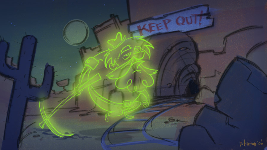
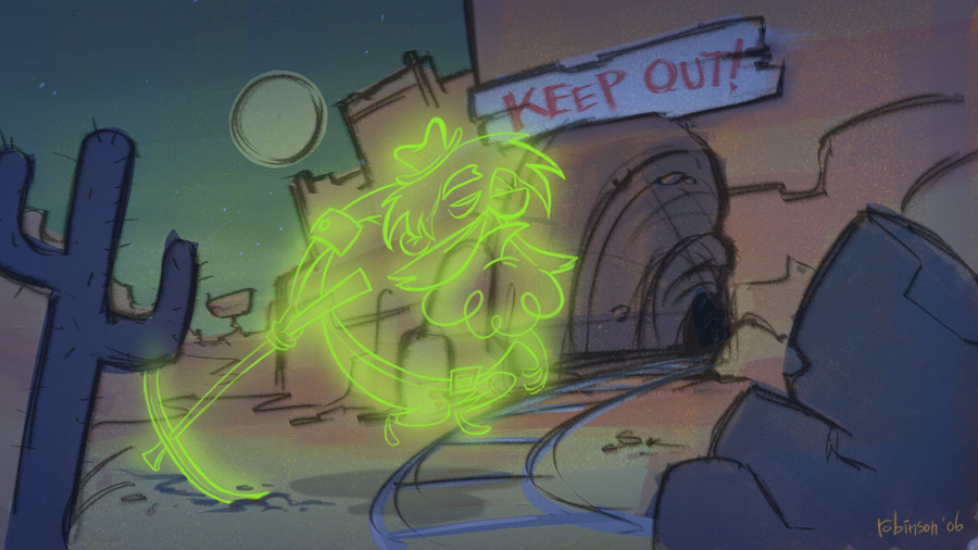
Illustration Friday: Ghost


I was inspired by Scooby Doo on this one. :]

Sunday, October 1, 2006

An Evening with Syd Mead

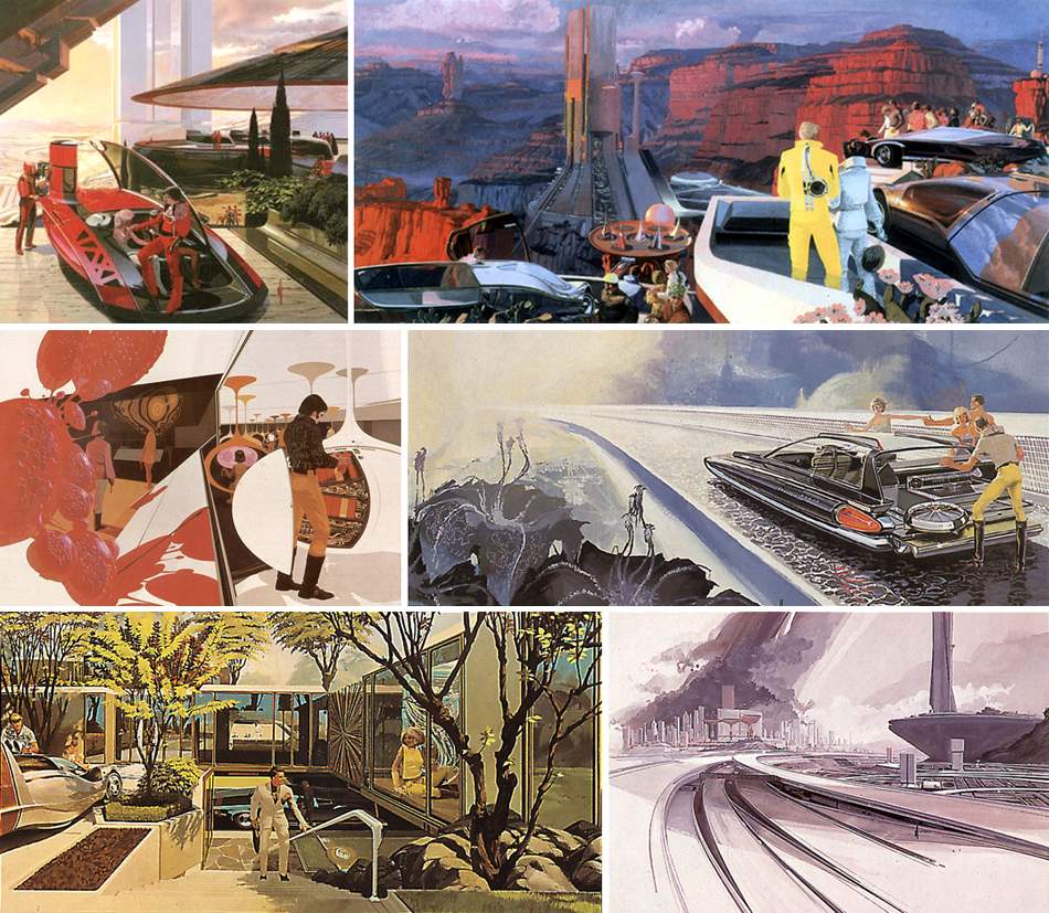
For those of you who are unfamiliar with the name, Syd Mead is a futurist and concept designer whose work has appeared in films like Bladerunner, Aliens, and Tron to name just a few. Last week he was in Rochester for a presentation at RIT. I made the trek out for the evening and was glad that I did. Though Mead is now entering his 70's, the man is still very active in the industry today and has a lot of useful stories and bits of information to share. What I was truly amazed by was his futurist concepts that he did while he was working at Ford in the 1950's. Somehow he was able to sit around all day creating these wild concepts for vehicles far in the future...I have a feeling that today that position no longer exists. (And not just because Ford is slowly going down the tubes.) Some of Mead's designs from 50 years ago have become a reality; notably one that functioned much like a Segway. Not that any normal person really uses a Segway. (Which makes me wonder how willing people will be to adapt to new modes of transportation.)


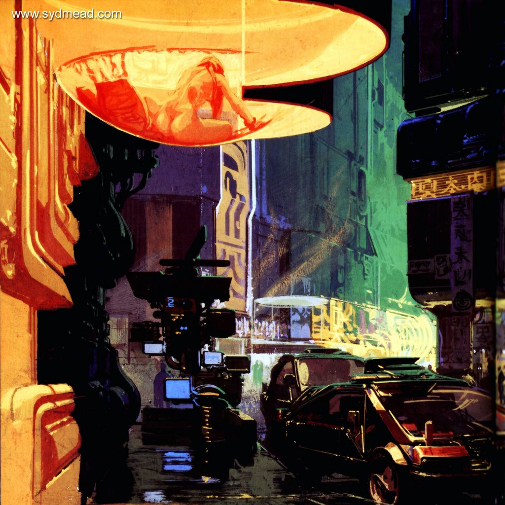
Mead discussed some of his work on Bladerunner, which really sounds like a great project to have worked on. Though it was hampered by budget constraints and Ridley Scott being fired at one point in production, it remains as a high point in sci-fi movie history. You know how sometimes you'll look at sci-fi concepts and not really understand what half the stuff is? Well Mead revealed that that is just part of the job. He will often throw some shapes together that have just the bare elements of a recognizable setting or object, but with plenty of extra features and dials and shapes to create a futuristic feeling. He showed one concept from Bladerunner of a bathroom in the future. You could tell that it was a bathroom because of the sink and the toilet-like device, (as well as the size of the room) but beyond that you'd be hard pressed to find anything else you'd recognize from a bathroom of today.

He also pointed out another concept (this one from a videogame) that had the classic ultra-detailed overly complex sci-fi look to it. He explained that in the future things would obviously be simpler and many tasks will be accomplished unseen (nanotechnology I assume), but for films and games people expect to see circuitry and pipes and wires and all that schmutz all over the place. To some degree I appreciate that classic look of "run-down and dirty sci-fi future," but at the same time I think it has been overdone and doesn't really reflect the way the future will probably be. (Whose to say, but as I mentioned before, there will probably be nanorobots that clean the streets and hopefully pollution will be eliminated.)


The only problem I found with Mead's work is that it still looks the same today as it did in the 1950's. His vision of the future has not developed as rapidly as technology has developed, but his rendering skills still blow me away. Mead recently released a series of DVD's with the Gnomon workshop, as well as publishing a few books from his own publishing company. I picked up the latest one, "Sentury," and got it signed by him. (Oh and I yanked these works from the net, thanks to whoever posted them.)