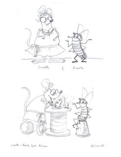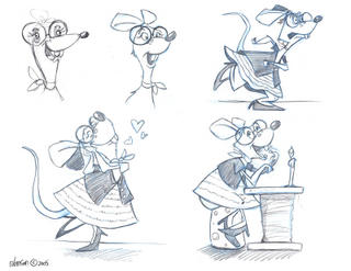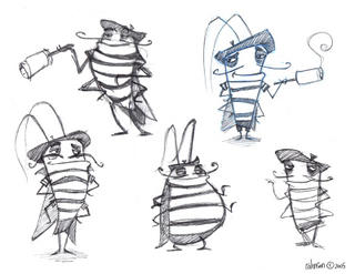
Here are the original designs for Pierre (a suave cockroach) and Suzette (a fat clumsy rat). After trying out other designs I seem to have come full circle...

A little too Disney?

I like the fat one but Pierre needs to contrast with Suzette, so I don't think that's gonna work out.


No comments:
Post a Comment